
О ПРОЕКТЕ
КОНТУР - не просто школа татуировки. Это теплая, уютная атмосфера семьи.
Школа помогает всем тем, кто осознает, что их реализация лежит в этой сфере. КОНТУР - как проводник в мир обретения дела по душе. Он заботится о своих подопечных, ведет их за руку, поддерживает и направляет. И главное во всем этом - состояние подопечных, которые приходят обучаться данному делу. Они четко понимают, что это то, что им нужно, они хотят в этом развиваться, они знают, что это дело по любви, и оно сможет им принести финансовую устойчивость и вдохновлять на покорение новых вершин.
ABOUT THE PROJECT
CONTOUR is not just a tattoo school. It is warm, cozy family atmosphere.
The school helps all those who realize that their realization lies in tattoo area.
The CONTOUR is like a guide to the world of finding something that they like a lot. It takes care of his wards, leads them by the hand, supports and guides them. And the main thing in all this is the condition of the wards who come to study this craft. They clearly understand that this is what they need, they want to develop in this, they know that this is a love affair, and it will be able to bring them financial stability and inspire them to conquer new heights.
ЗАДАЧА
Разработать фирменный стиль для тату-школы. Выделиться на фоне конкурентов, привлечь новую аудиторию. Показать, что тату-бизнес это интересная сфера реализации. Что тату - это про стиль, творчество и эстетику.
TASK
To develop a corporate identity for a tattoo school. Stand out from the competition and attract a new audience. To show that the tattoo business is an interesting area of implementation. To show that tattoo is about style, creativity and aesthetics.

РЕШЕНИЕ
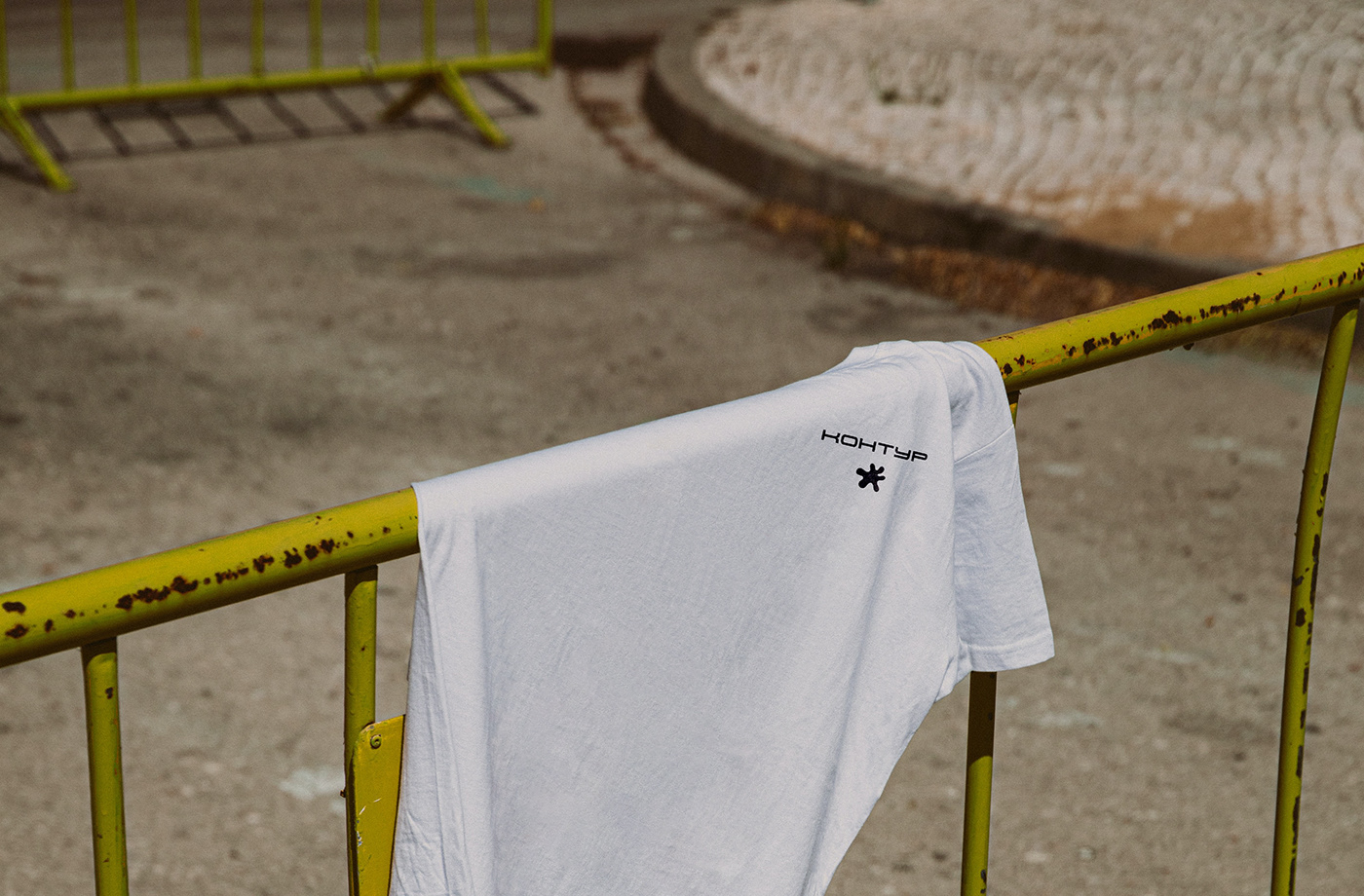
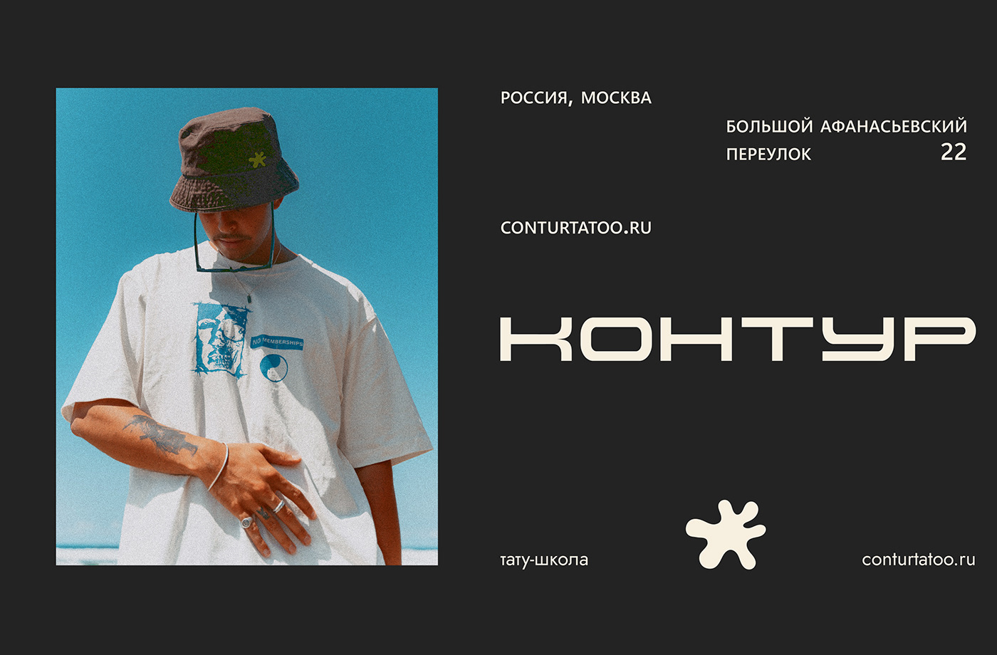
Создан логотип формата шрифт+знак.
Шрифтовая часть логотипа выполнена моноширинным неконтрастным шрифтом без засечек. Такой шрифт говорит о надежности, устойчивости, монументальности, что создает ощущение чего-то несокрушимого, того, на что можно положиться и чувствовать себя как за каменной стеной. За счет этого данный шрифт хорошо сочетается с темой образования и сферой тату и символизирует приобретаемые во время обучения твердые навыки.
Кроме этого, в шрифте присутствуют округлые и широкие формы, чтобы передать ощущение заботы, широты объятий, а также, приобретаемые софт скиллс.
Кроме этого, в шрифте присутствуют округлые и широкие формы, чтобы передать ощущение заботы, широты объятий, а также, приобретаемые софт скиллс.
DECISION
A font+sign format logo has been created.
The font part of the logo is made in a monospaced non-contrasting sans-serif font. Such a font speaks of reliability, stability, monumentality, which creates a feeling of something indestructible, something that you can rely on and feel like behind a stone wall. Due to this, this font fits well with the theme of education and the tattoo field and symbolizes the solid skills acquired during training.
In addition, the font has rounded and wide shapes to convey a sense of care, breadth of hugs, as well as acquired soft skills.
In addition, the font has rounded and wide shapes to convey a sense of care, breadth of hugs, as well as acquired soft skills.

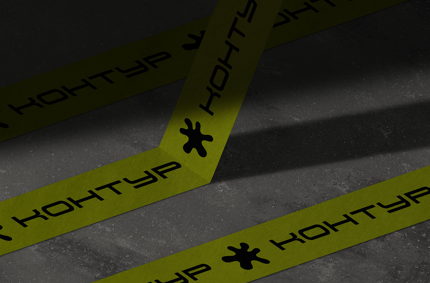
Фирменный знак логотипа — растекшаяся капля — капля краски для татуировок.
6 ответвлений обозначают основу и ценности бренда:
реализация, стиль, свобода, семья, тату, творчество.
Необычный стильный контур капли создает соединение названия и знака бренда, тем самым усиливая запоминаемость, а заливка формы олицетворяет «закарас»
6 ответвлений обозначают основу и ценности бренда:
реализация, стиль, свобода, семья, тату, творчество.
Необычный стильный контур капли создает соединение названия и знака бренда, тем самым усиливая запоминаемость, а заливка формы олицетворяет «закарас»
The brand name of the logo is a spread drop — a drop of tattoo ink.
6 branches denote the basis and values of the brand:
realization, style, freedom, family, tattoo, creativity.
The unusual stylish contour of the drop creates a connection between the name and the brand sign, thereby enhancing memorability, and the filling of the mold embodies the "fill"
6 branches denote the basis and values of the brand:
realization, style, freedom, family, tattoo, creativity.
The unusual stylish contour of the drop creates a connection between the name and the brand sign, thereby enhancing memorability, and the filling of the mold embodies the "fill"


Спасибо за просмотр!
Thank you for watching!
Вы можете связаться со мной любым удобным для вас способом
You can contact me in any way convenient for you using the links below
instagram: alisa_brandland
telegram: alisaagleeva
mail: alisaagleeva@mail.ru
telegram: alisaagleeva
mail: alisaagleeva@mail.ru


